Read the Poster Before the Roster: Decoding UK Festival Artwork in 2026
There's a particular kind of Tuesday morning in late winter when a UK festival posts a graphic and nothing else. No names. No stage splits. No ticket tier. Just artwork, a date and a location. Within the hour the replies split in two: half the comments are people decoding the typefaces for clues, the other half are people demanding the lineup.
That ritual deserves more credit than it gets. In 2026, the festival poster has quietly become a genre of its own — a piece of design that tells you almost as much about a weekend as the booking sheet does. Sometimes more.
The poster is the first booking decision
Long before a promoter signs off on a headline act, they sign off on a visual language. That decision isn't cosmetic. A poster is the first place a festival commits to an audience: who it wants in the field, how old they are, how far they'll travel, and whether they'd rather be in a tent at three in the morning or on a picnic blanket at three in the afternoon.
Look at the small weekenders and you'll see restraint. Two or three typefaces at most, a hand-drawn mark, a palette lifted straight off a risograph print. That's not laziness — it's a signal to a specific punter that this is a place where the bill is put together by a person rather than an algorithm. The design is saying: trust us, we've done the reading.
Now look at the city-wide events. Density, colour blocking, a grid that looks like a train timetable on purpose. Those posters are selling a completely different promise — volume, choice, the low hum of missing out on a room you haven't found yet. Neither approach is better. They're just aimed at different nervous systems.
Hierarchy is the honest bit
If you want to know what a festival actually thinks of itself, ignore the logo and read the top three lines. The order of names on a poster is the least glamorous and most revealing document in the industry.
A poster that parks a heritage act at the summit and stacks emerging names at sixty per cent scale is telling you where the ticket revenue comes from. A poster that pushes a mid-tier name into headline position is telling you something else entirely: that the event is betting on a scene rather than a legacy, and that it expects its audience to already know the words.
Watch the size jumps too. When a name appears in a font twice the size of the act directly beneath it, that's a promoter with a point to prove. When eight names sit at near-identical scale, that's a promoter saying the bill is the whole point. Both are honest. Neither is an accident.
Typography as a scene flag
Type is where UK festival design gets properly tribal. The crunched, distressed sans-serifs that dominate bass and soundsystem posters aren't trying to be legible at thumbnail size — they're trying to look like a flyer you'd have seen stapled to a lamppost two decades ago, and for the audience they're aimed at that's an emotional trigger, not a design flaw.
Then there's the opposite move: the airy serif, the wide letterspacing, the quiet lowercase wordmark. That's the folk-and-adjacent weekender dialect, and it's been refined so thoroughly that you can now identify a festival's booking policy from across a room. The type does the work the copy used to do.
Somewhere in the middle sits the most interesting stuff happening right now — a serif headline sitting on a hard-edged grid, or a hand-painted mark pasted over a digital layout. That collision is the visual equivalent of a lineup that puts a shoegaze band on after a drill act and somehow makes it work.
Texture, print and the deliberately cheap look
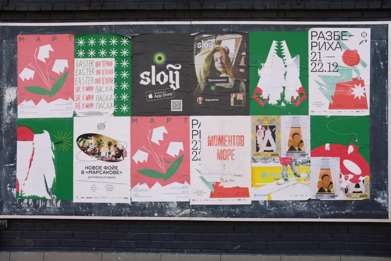
One of the more charming developments of the past few years is how many festivals have started designing for the photocopier again. Visible paper grain. A touch of ink bleed. A palette that looks like it's been through a bad scan and come out better for it. Some of that is nostalgia, some is budget, and a fair chunk is a reaction against the hyper-polished, template-driven look of the streaming era.
For fans, this is genuinely useful information. A poster that looks printed has usually been made by people who care about the physical object — which tends to correlate with merch worth buying, programmes worth keeping and a site that's been thought about rather than outsourced.
The city event and the field do different jobs
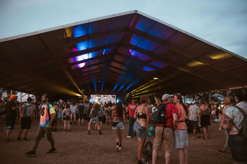
It's worth separating the two, because they're often judged by the same standards and shouldn't be. A field festival poster is an invitation to disappear for a weekend. It wants to feel like a place. Landscape formats, horizon lines, little illustrated details you only spot on the second look — all of that is doing the work of atmosphere.
A city-wide event poster is a navigation tool. It has to work on a phone screen at 11pm on a Friday, it has to survive being screenshotted into a group chat, and it has to make a sprawl of venues feel like one coherent thing. That's why the design language leans hard on grids, blocks and bold single-colour treatments. It's not less creative. It's solving a harder problem.
Reading it like a local
So here's the practical upshot: you can now do a decent first-pass judgement on a festival before a single act is announced. Ask four questions of any poster. What is the type saying about who this is for? What is the hierarchy saying about where the money is? What is the texture saying about how it's run? And what is the layout saying about how big it expects to be?
If the answers line up, the lineup becomes almost beside the point — you already know whether you're the intended audience. If they contradict each other, glossy design over a scrappy hierarchy with no clear sense of who it's for, that's usually a festival still working out what it wants to be.
Which is fine. Just be aware you'll probably find out in a field rather than on a screen.